Job Loss Metrics in the Tech Industry
Created By: Jonathan Kertawidjaja, Philip Hadiwidjaja
Website Link: https://jon-kert.github.io/Tech_Industry_Job_Loss/
Original Dataset Link: https://layoffs.fyi/
Introduction
We wanted to tailor our project with the industries we are interested in pursuing in our careers. Given recent downward trends in tech-related jobs, we thought that it would be interesting to center our final project on the issue of tech layoffs. We hope to gain a deeper understanding of the current state of the tech industry while gaining valuable experience and practice with the skills learned throughout this semester.
The dataset we will be using for this project comes from kaggle and can be accessed through this link. The original dataset is from layoffs.fyi. The data set captures layoff events in the tech sector from 2020 to 2024, including both large-scale and smaller workforce reductions across a variety of companies and industries. The data set only contains one CSV file with 16 columns and 1672 observations.
Research Question
Our main research question is: Is the percentage of workforce reductions related to the year of the layoffs as well as geographical and company-level characteristics?. Additionally, we aim to predict the layoff percentage a company faces given the year and company-level characterisitics. These are the features that we will focus on in our investigation:
Features:
- “Stage” — Funding stage (e.g., private, public, growth-stage)
- “Industry” — Sector or type of tech company (e.g., fintech, SaaS)
- “Money_Raised_in_$_mil” – Total funding raised in millions of USD.
- “Company_Size_before_Layoffs” - The amount of employees before workforce reduction
- “Percentage” - This is the target variable that we are trying to predict. Given the features above, what is the severity of the layoffs?
- “Laid-off” - This is also a target variable that is tangential to the percentage variable in that we are trying to predict the amount of employees laid off given the features above
Data Cleaning and Exploratory Data Analysis
Our process for cleaning involved several steps:
- We converted the date into timestamp form
- Turned the ‘Money_Raised_in_$_mil’ column into numerical data
- Drop values where the ‘company_size_before_layoffs’ is missing
In dealing with missing values in ‘Money_Raised_in_$_mil’, we imputed the missing values with the average value of the closest observation match by ‘Industry’ and ‘Stage’. If there were no such match, we used the average value of an observation matched by ‘Industry’.
Univariate Analysis (a)
In the plotly histogram below, it can be seen that the distribution of layoff events categorized by the stage of the company (i.e. Series H, Post-IPO, etc.). Most of the reductions in the workforce seem to be happening in Post-IPO companies, which are bigger companies that have gone through multiple rounds of investment and are established(hold good amount of market share) in their respective industry. This makes sense because Post-IPO companies are more subjective to layoffs due to pressure from the market/industry. Contributing to our research question, this graph shows that there could be a correlation or indication of high percentage of layoffs given the company’s stage as there are more occurences of layoffs.
Univariate Analysis (b)
The violin plot below shows the distribution of values found in the “Percentage” column of the dataset. The bulk of the percentages lie around the 5-20 range, with few outliers lie between 60-100. After further investigation we found that companies that fell within the 60-100 range were predominantly in the early stages of growth. These companies often have fewer workers, thus even losing a small number of workers would raise their loss percentage. A high percentage loss of workers in an early-stage company will most likely equal a low-percentage loss of workers in a later-stage company. These findings indicate that an early stage company is more likely to face a high-percentage loss of workers.
Bivariate Analysis (a)
The graph below correlates the total amount of workers laid off by year and quarter. For reference, the quarters refer to the following range of months:
‘Q1’ : January 1st - March 31st ‘Q2’ : April 1st - June 30th ‘Q3’ : July 1st - September 30th ‘Q4’ : October 1st - December 31st
From the graph below it can be seen that the overall trend of workers laid off seem to have spiked in 2023 and 2020 during this 4 year period. There could be a multitude of including broader economic and political factors that cannot be predicted. For instance, the initial shock between 2020 Q1 to 2020 Q3 can be attributed to the emergence of Covid-19 forcing many companies to let go of their employees as a result of economic shock. In 2023 Q1, the spike could be attributed to tech layoffs that resulted from the mass hiring spree that companies went on in the years prior. After further investigation, we have come to the conclusion that the different quarters would not be a useful predictor mainly because of the unpredictability of real life events that may heighten the amount of layoffs in a quarter.
Bivariate Analysis (b)
The bar plot below shows the relationship between the categorical column ‘Stage’ and numerical column ‘Laid_Off’. Notably, aside from the ‘Acquired’, ‘Post-IPO’, and ‘Private Equity’ stages, there appears to be a trend of increaseing numbers of workers laid off as companies mature. The reason for this trend is because companies often start out with a smaller workforce, and as they grow there is a greater potential for a larger number of workers to be laid off. This figure shows that the company stage can be quite indicitive to how many workers are laid off.
Aggregation
The figure below is a heatmap which represents a pivot table that aggregates the ‘Stage’, ‘Industry’ and ‘Percentage’ columns. Each cell in the heatmap represents the average percentage loss a companies that falls into 1 specific Stage and 1 specific Industry. The heatmap highlights the intensity in the relationship between Stage, Industry, and Percent-loss, allowing us to identify patterns among different Industry types and company stages.
Imputations
Since we are not using all of the columns in the data set, we started off by only extracting the columns we need and dropping ones that are irrelevant to our data analysis. During our preliminary data analysis, we discovered that some of the columns contain missing data. Here are the numbers below:
- ‘Laid_Off’: 107
- ‘Percentage’: 102
- ‘Company_Size_before_Layoffs’: 161
- ‘Company_Size_after_layoffs’: 136
- ‘Money_Raised_in_$_mil’: 76
In order to tackle the problem, we took on each feature individually.
Before: Distribution of Money Raised in millions USD For the Money_Raised_in_$_mil column we realized that some of the values were missing mainly for industries that have sensitive data such as Healthcare or other industrieswith private organizations. In order to fill in for the data without any bias, we decided to impute using a grouped mean imputation. This imputation filled in the missing values of the column with the mean of the corresponding industry and stage of the data set. We wanted to make sure that we filled in the values that best reflected the company’s current attributes.
After that this initial imputation, we realized that 3 of the values were still missing as there was no such combination of industry and stage so we decided to impute using only the stage. We used industry instead of size mainly because of the differences in markets. For instance a seed company in the healthcare industry might make more money than a seed in the security industry.
After: Distribution of Money Raised in millions USD
As can be seen from the graphs below and above, the distribution of the Money Raised doen’t really change. The mean decreases 2 million while everything else remains the same. There is no big change when we imputate the column
Before: Distribution of Company Size before layoffs
We decided to drop the missing values that do not have the company size before layoffs mainly because it serves no use in trying to discover the affect that company characteristics have on the percentage of layoffs within a company. During our investigation, we discovered that all the rows with missing values in this column specificall, had missing values in the percentage and Company size after layoffs column. Although we are dropping some of our data, the distribution as well as the median do not change, meaning that dropping these datapoints would have no significant impact on our overall data.
Framing A Prediction Problem
Our goal was to predict the ‘Percentage’ column, a numerical feature that represents the proportion of workers laid off at a particular company. By focusing on this target, we aim to identify which features most significantly influence job loss across various industries. This is a regression problem as we are interested in any possible correlations between numerous features and the layoff percentage.
We selected Root Mean Square Error (RMSE) as our evaluation metric because it works well with measuring error in predictions related to percentage values. RMSE provides a clear quantification of prediction accuracy by penalizing larger errors more heavily, making it particularly effective for capturing deviations in our continuous target variable. Thus, RMSE will provide a meaningful assessment of our model’s performance in this context.
Baseline Model
For our baseline model we created a linear regression model that includes 2 numerical features, and 2 nominal features:
- ‘Stage’ and ‘Industry’ were both OneHotEncoded
- ‘Money_Raised_in_$_mil’ and ‘Company_Size_before_Layoffs’ were not altered, but were used to fit the model
Through our exploratory data analysis we identified these four features as having trends that were worth noting. We speculate that the amount of money a company generates might serve as a strong indicator of its overall health and stability, as companies that generate higher revenues might be less suspectible to increasing layoff percentages. We also speculated that the company stage and industry could hold significant correlational value due to operational challenges that present themselves in each of these specific areas.
rmse: 21.24438856817141 %

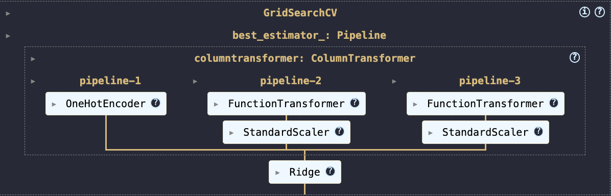
Final Model
In making improvements to our existing model, we sought to further generalize our model to unseen data. The first step we took was to preprocess our data through feature engineering 2 features. The first feature we engineered was ‘Money_Raised_in_$_mil’. We did this by taking the square root in order to reduce skew, a result of the bigger companies in the data set. The second feature we engineered was the ‘Company_size_before_layoffs’. We did this by taking the log base 10 of each value, trying to compress the larger values and reducing the outliers in the dataset. After both were engineered, we used StandardScaler() to center the feature and balance the coefficient which is pivotal for Ridge. As for the categorical variables(‘Industry’ and ‘Stage’), we kept those consistent with our base model and only OneHotEncoded them. Due to the multicolinear nature of our features (namely the use of 2 OneHotEncoded categorical features), we used Ridge to maintain predictive stability in our linear regression model.
rmse: 19.4234520461352 %